Showing posts with label print. Show all posts

Thursday, November 12, 2009

Screenprinting Illustrator Work Pt. II

Round two; my first CMYK printing experience was really, really frustrating at first. I assumed that process colours were just mixed in a similar manner to spot/pantone, and stupidly decided to use my initiative and began just mixing process colours, before being looked at like an idiot and told that precise measurements were needed.
This was after I'd printed out several positives from the computer at a dpi that was far too fine for CMYK. After these two mishaps, I began printing Yellow first - assuming again, like spot colours, that lightest comes first, and had to clean up and start again. Of course these all seem pretty obvious now, but I guess I couldn't of worked these out otherwise and the more annoying way I find out the more likely I am to remember these things in the future.
Anyway, the finished product came out so, so much better than the first spot-colour piece, this was owed almost entirely to the Registration Marks. Being a total nerd I actually appreciate the aesthetic of this kind of left-over working, however as helpful as these were in lining the work up perfectly, I can't imagine if any commissioned screen printing work came about that the presence of these in the finished piece would be an option. A majority of the staff in Vernon Street kept pushing me to tape them up because they would be 'unsightly'. So I guess I would have to perhaps crop them out in the future.


Colour-wise I'm really happy with the finished piece as well, having not printed CMYK before I was unsure how similar to the original on-screen piece the colours would look, but I think they look amazing despite the lack of likeness. I guess this was kind of a happy accident - but I've learnt a lot from it. Now that I know the aesthetic differences between the two as well as the practical, I feel comfortable about making judgements on the appropriate process for future work in the screen printing studio and the fact that there's a huge amount of options available for me to engage with dependent on the work I would like t produce.


Tuesday, November 10, 2009

Team Print


Our groups' little day trip that Paul organised to Team Print studios was actually incredibly inspiring. It made me realise not only how much of an industry their was and how much graphic designers rely on something like this, but also the amount of different processes, technology and possibilities there was in a well equipped digital print warehouse like this. The dude that took us around was really friendly, he gave us presents and drove us home, it was the best day ever. The warehouse was massive, I didn't expect anything like that size, but as far as it seemed Team Print were a pretty successful company; they had a decent flow of jobs coming from all over the UK. What was good to hear was how closely they worked with designers, like you could take work for mock-ups and try a few different processes until you got it the way you want it. There was a huge array of different printers for big and small jobs, a lot of the different printing techniques were well over my head, it was a whole new world to me, but in a good way.

It looked like the future for print studios like Team Print was the proper massive ink jet style digital printers, that printed continuous lines rather than dots like on a normal litho printer. At the moment they can only do up to A3 and were a lot better for smaller jobs but they definitely produced much higher quality prints, so it was interesting to see that in action. Also, some of the work like templates for business cards needed to be done through other businesses so felt like that was a little bit of an insight into how the industry worked.

Tuesday, October 27, 2009

Screenprinting Illustrator Work


So this was the first time I properly screen printed some of my own work, the overall process was extremely satisfying, although there's clearly a lot of things I need to work on. Because I chose quite a specific palette of colours, I thought it best I mix them and print them as spot colours - clearly this was a bad idea. I love love the way the colours came out but the process was incredibly long winded, and this piece was the first in a series of three (and the one with the least colours). The most tasking (and soul destroying) part of the process was the final part, the wafer thin black outline, of course because I'd already printed three colours some would be slightly off from where they were supposed to be exactly. As a result it was extremely frustrating attempting to line up the black lines with the rest of the piece and I ruined several of the pieces as a result. The Vernon Street print room staff were really helpful so the last few came out pretty much perfect. What I reckon I'll do in the future, and on the other pieces is either use different tints for the spot colours to lessen the amount of layers or (and it would be worthwhile to try out anyway) just go with the straight 4-layer CMYK and see how the colours turn out, cos trying to screen print every single one of these separations??!
What was suggested I could do to combat the problem of jaunty layers was using Registration Marks when printing them out from the computer and maybe having the colours slightly wider than before so they fill the black lines more easily. 
I definitely feel more confident using the print studios now and the beauty of having a kind of triptych of work is that I have three similar pieces to progress with and address different problems I come across, the only problem maybe that the third and final piece will be ten times better than the first. Considering I'm starting with quite complex work to begin with I reckon working in the studio will be a lot easier with less complicated prints.

Monday, October 12, 2009

Blenheim Print Room Induction


I haven't heard that many good things about the Blenheim Walk print studio, but they seem to have a really good range of facilities, as far as I remember they've got pretty much the same deal (maybe less?) with screen printing as Vernon Street, but it's a lot more textile orientated. I don't know much about screen printing so it was good trying out the vacuum and just kind of seeing how it worked. We practiced doing a CMYK screen print which seemed pretty easy but I can imagine it going wrong if I was left to my own devises. We were shown general safety etc. before we got to have a go at flock and foil printing. The example ones we were shown were pretty lame, but I can imagine them being of use in the future, it all seemed quite simple in process but you could easily produce some really interesting work. I'd definitely like to practice the multi-colour screen prints and peel myself away from the computer a little.

Thursday, October 8, 2009

Adobe Illustrator // Design for Print


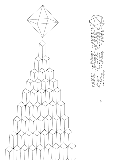
I thought it would be best to start with technology that was most easily accessible, Adobe Illustrator. I'm familiar with a great deal of Adobe software but have never actually fully engaged in the possibilities of the different tools available in Illustrator. In all fairness the Adobe Creative Suite has so many crossovers, I wasn't sure - being pretty comfortable with Photoshop - if there was any point in using Illustrator until attending the workshop/tutorial, where I was made aware of the possibilities, particularly the Pen Tool. There is clearly a great deal more freedom in creating original graphics rather than feeling like you're just kind of 'tinkering' with old work on photoshop. I used the pen, elipse, rectangle, line segment, warp and slice tools, used the pathfinder and a host of other tools and options & generally explored and experimented with the possibilities in creating graphic work. I found there was a sense of rigidness when working with illustrator, its more obvious you are using computer software whereas with Corel Paint you can kind of get lost in drawing - especially when using a graphics tablet - and forget your just sitting at a screen sending commands. Not that this is a bad thing - I like the result of the rigid vector graphics I used to create the little fantasy world of triangles, diamonds and complex linear structures.
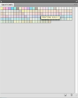
I exported the images as png's into Photoshop, adjusted the levels slightly and started messing with different swatches, initially, it seems the Pantone coated pastel swatches worked nicest, but this is before I've attempted any 'real' printing

Once I'd finished adjusting all the colours, I used the colour seperating tool to print my silkscreen printable copies, splitting them into the necessary CMYK components. I felt that there wasn't much point in attempting a spot colour with this version so i created an alternate colour version to see how that could work. Next stop Print studios!